Your Guide to Bulletproof Email Buttons that Work | Litmus
If your webpage is your store, and your email is your shop window, then your call-to-action (CTA) button is your amazing window display that draws people in. Needless to say, your CTA is one of the most important parts of your email, and if it’s hard to find, hard to use, or broken in any way, your subscribers aren’t going to click!
Don’t worry, though. We’re here to help make sure your CTA buttons are bulletproof and can be seen by all customers, regardless of email client or viewing preferences..
In this blog post, we will dive deeper into the methods of crafting bulletproof buttons for your subscribers to improve the user experience—and your email campaign performance.
Here’s what you’ll discover:
What’s a bulletproof button?
Bulletproof buttons are call-to-action buttons built with code instead of images. You can reliably swap your GIFs, PNGs, and JPEGs for HTML and CSS. By only using code, the button will display in all email clients even with images off, hence making them “bulletproof.”
What’s more, you can update the content and style of your buttons by simply editing your HTML template. You no longer have to waste time crafting buttons in a design tool like Photoshop, uploading them to a server, and updating your HTML.
Do not use bulletproof button images
I’m going to say this once and then never say it again. The only truly bulletproof button is an image.
I know. But that’s really the only way you can guarantee your button looks exactly the same in 100% of email clients. Because we all know how inconsistent our emails can look across different email clients, apps, and devices.
Despite this, you should never use an image-based button. Image buttons get lost when images are turned off because of image-blocking, and they’re not accessible for your subscribers who use screen readers (more on that in a second).
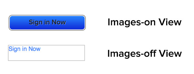
If your CTAs are contained within images, there’s a good chance that subscribers are missing out on your message. Even worse, they aren’t interacting with your campaigns.
Using image-based CTA buttons also impacts the accessibility of your email. If you’re hiding the context of the CTA inside an image, screen readers may not be able to read them, making your email inaccessible for visually impaired subscribers.
Now that you know more about image buttons, you should realize that my initial statement is only mostly true. Image-based buttons look the same in every email client where images are turned on and only if the subscriber isn’t using a screen reader. So are they actually bulletproof? No. And as both of these above-mentioned cases are impossible to track using standard email tracking, there’s no way for you to know what percentage of your subscribers are having this bad experience.
So ditch the image CTA and make sure your subscribers can see and use your CTAs no matter what device they’re using.
What makes a beautiful button design?
Buttons are more than just code though. There are several factors that go into making your buttons usable and eye-catching.
Email button shape
Make your buttons look like buttons.
We all like making fun and unique buttons, but often if you stray too far from what’s expected, subscribers will miss the intent—and not take action. Yes, the words may say something is clickable, but as they say, “A picture is worth a thousand words.”
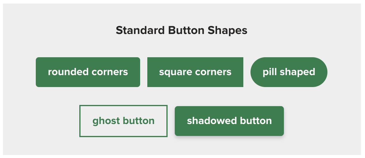
Use standard button shapes to ensure you catch people’s attention, especially if they’re scanning. Standard shapes include:
- Rounded corners
- Square corners
- Pill shaped
- Ghost button
- Shadowed button
That isn’t to say you can’t do fun things with buttons. Magic Spoon added some fun animated GIFs to their buttons to draw even more attention to them.

Email button size
With over 40% of subscribers opening emails on mobile devices, according to our annual state of email engagement report, it’s important that your button is designed so it works across all devices.
If your button is too small, it will be hard to click on mobile devices. If it’s too large, it looks less like a button and more like a design element.
The ideal size for buttons for easy clicking on mobile devices has been translated to be between 42px and 72px (approximately 11-19mm). This seems about average for button height seen around the web, and the buttons we use here at Litmus fall within that range as well.
In one study that went up to 30mm, the tap-to-click accuracy plateaued at 20mm, so there’s a point where button size doesn’t make that much of a difference anymore.
Email button space and padding
Make sure there’s enough whitespace around your buttons, too, so they stand out. This also makes it easier for your subscribers to click the correct button.
The best example of this would be an email with several links in one paragraph. If you bunch your links close together, your subscribers are never going to accurately click on what you want them to click on, especially on mobile.
Visual feedback
Not every email client supports interactive emails, but where possible, adding a little interactivity to provide visual feedback helps subscribers know their interaction has registered.
It’s an extra sign to them that something is clickable.
This can be as simple as a change in color or more complex depending on your preference. (We know sometimes it’s fun to go all out, so don’t hold back—but know when to rein yourself in.)
Our own standard button has a color change as well as a push button effect.

But we did try something new, too, and had a lot of fun with our January newsletter buttons. A great design element that was also fun to “push.”

Email button text and font size
Keep your actual CTA copy or label actionable and to the point. Tell subscribers what you want them to do as clearly and concisely as possible.
1 to 5 words is usually enough.
That length also keeps your email scannable. And if you have more to say? Include it in a headline over the button. By regularly keeping CTAs within 1 to 5 words, it makes the rare moment you do go over it stand out in a much more meaningful way.
5 ways to code a bulletproof CTA button
With over 300,000 potential email renderings, is it really surprising you can’t make one-size-fits-all button styles that work everywhere?
What you can do is make a button that works almost everywhere. And there are a few different methods for creating these buttons depending on your needs. Take a look through these to figure out which one works best to support your subscribers.
1. Conditional-padding button
Thanks to Mark Robbins for this conditional-padding button. It’s the one we use here at Litmus.

This button uses styling on the link to style it for everyone except Outlook. Then, it uses conditional code to add Outlook-specific padding and border-radius. Since the Outlook padding is controlled separately, you can edit the Outlook padding without impacting what the button looks like in other email clients.